Tix provides no-code tools that enable event organizers in Africa to create and monetize live or virtual events with ease. The platform also allows quick payment acceptance and provides guests a seamless way to book and attend events.
I redesigned Tix's entire web application after identifying usability issues with the MVP. The redesign increased event creation, boosted efficiency, and laid a foundation for expansion into new African markets and future product improvements.
Role
UX Design
Prototyping
Product Design
Results
432% increase in self-serve events
Unified design language across all platforms
452% ticket sales growth (vs. 2021)
Expansion into Ghana & South Africa
Team
Folayemi Agusto, Shalom Ayidu, Dami Ajayi, Kazeem Onisarotu, Elo Akabike, Toluwalase Adegboyega
Defining the Problem
Before joining Tix as the only product designer, one of the founders had designed and implemented a beta release of the platform. This version had critical design and usability issues that needed immediate attention despite being efficient in setting up events and selling tickets. These issues had implications for user experience, hindered business growth, and needed to align with current market trends.
We started by speaking with our customer support representatives to understand their most common challenges and requested features.
Feedback from users indicated that the existing dashboard lacked vital features that organisers needed. We also learned that event organisers fall into two main groups: one seeking a robust system that could be adapted to their needs. The other wanted a simple, easy-to-use system with basic functionalities.
Additionally, we sought inspiration from software applications operating within a similar industry. Notably, from industry leaders such as Eventbrite and Ticketmaster.
The outcome of our analysis
Creating events and setting up tickets on the platform could have been more user-friendly, making it difficult for event organizers to set up their events efficiently
The platform's inconsistencies in visual language resulted in various typography, colour schemes, and layout elements across different sections
The checkout's limited customization options hindered organizers' ability to tailor the experience to their specific event needs
The event management dashboard requires more clarity in navigation and more actionable, informative data
The dashboard could be more responsive on mobile devices, with some features and functionalities breaking or becoming difficult to use on smaller screens
Tix's business goals included
Expanding the user base
Optimising the marketplace's demand side
Introducing features like 1:1 events, recurring events, box office
In light of these challenges, the redesign aimed to simplify the user experience, improve navigation, and enhance the overall visual design to boost attendee engagement.
We started by helping our creators get their events up and running.
Setting up the dates, times, and tickets was the most challenging part of the process. Some creators had one-day events, while others had recurring events with a range of ticket pricing. In both cases, the creators needed to be able to create events on Tix.
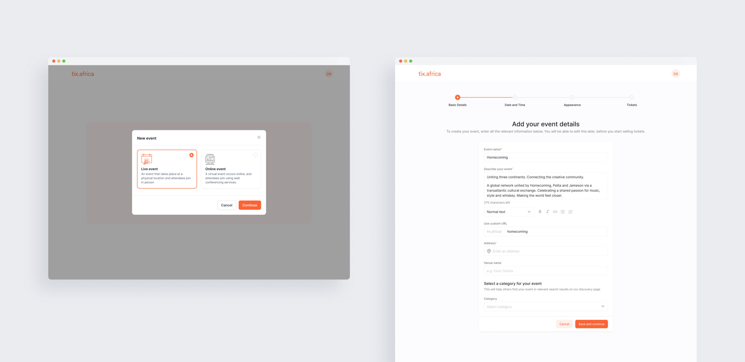
The previous design presented all event details on a single screen, including date, time, and additional information. This approach overwhelmed creators with too much information at a time. To address this, we have reorganized the process into four clear and concise steps: Basic Details, Date and Time, Appearances, and Tickets. This simplified structure provides a clear and straightforward approach for users to follow easily.
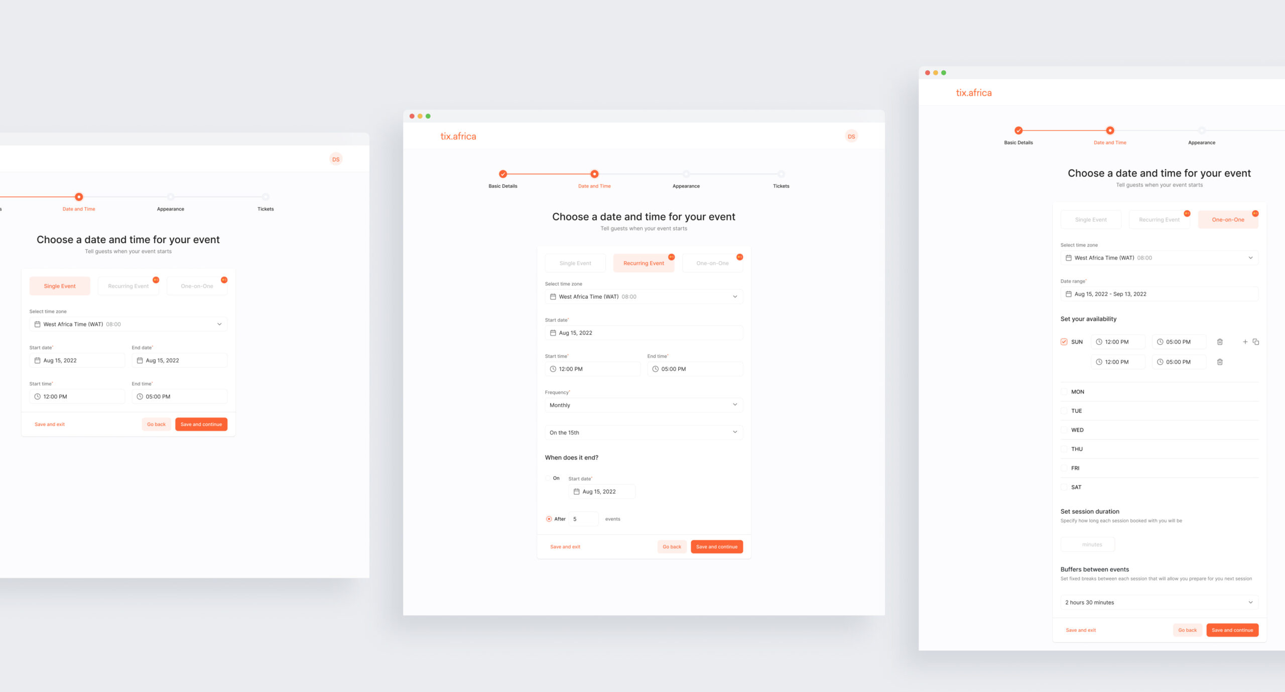
For the date and time step, the event types have been separated into three distinct tabs: Single Events, Recurring Events, and One-on-One Events. This distinction gives users the necessary entry fields based on their chosen event frequency type.
For recurring events, they can easily input event frequencies and end dates. For one-on-one events, Organizers can choose date ranges, available times, and session durations in minutes and manage buffers between events.
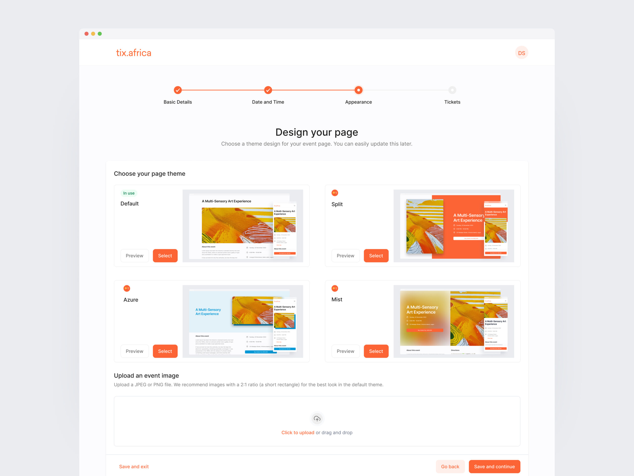
Users can customize event checkout pages in the appearance step by selecting themes. Previewing each theme informs decision-making, and suggested image ratios simplify image uploads.
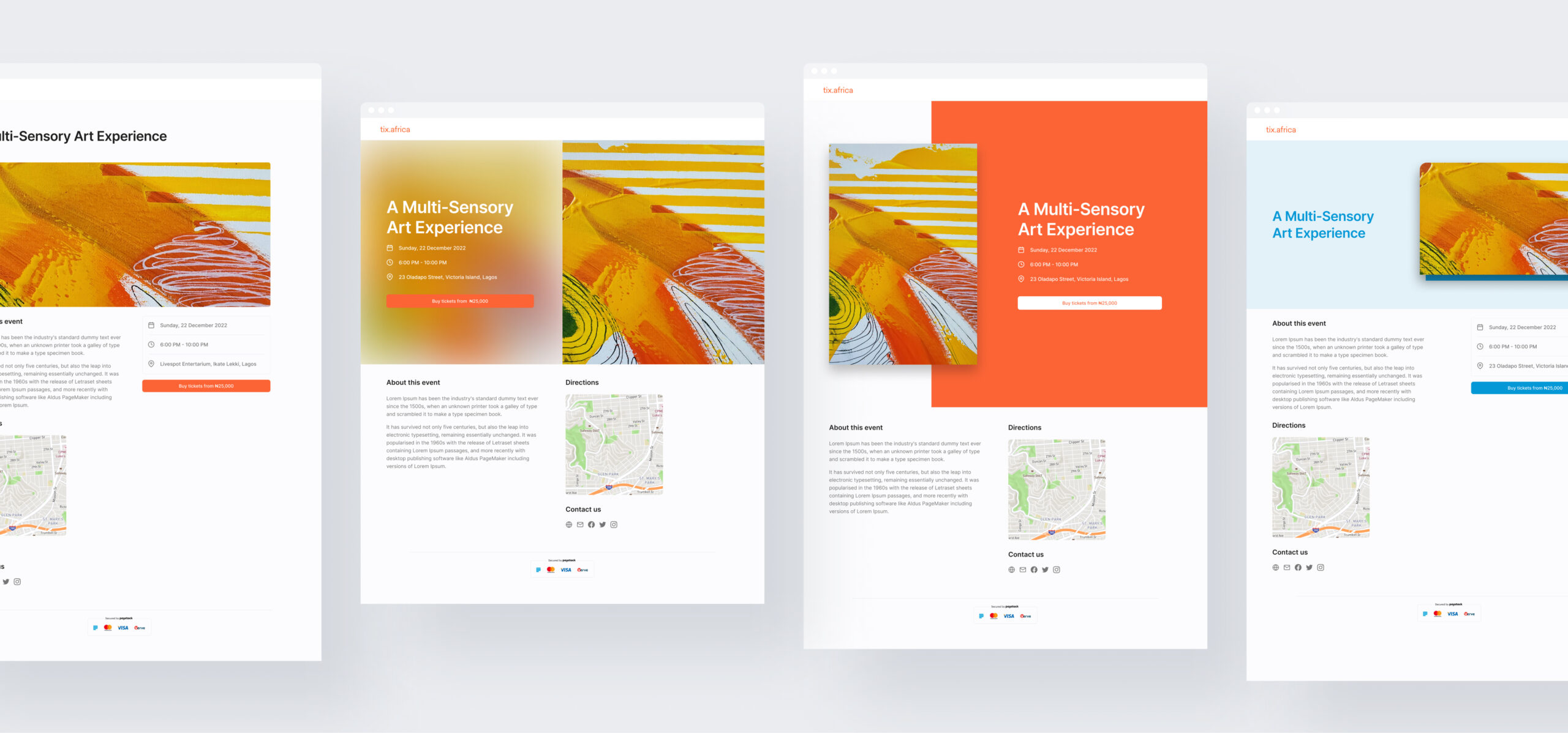
Four themes are available, including a default and three premium themes (Split, Azure, and Mist). This allows users to personalize their event pages and encourages subscriptions to premium plans for access to exclusive themes.
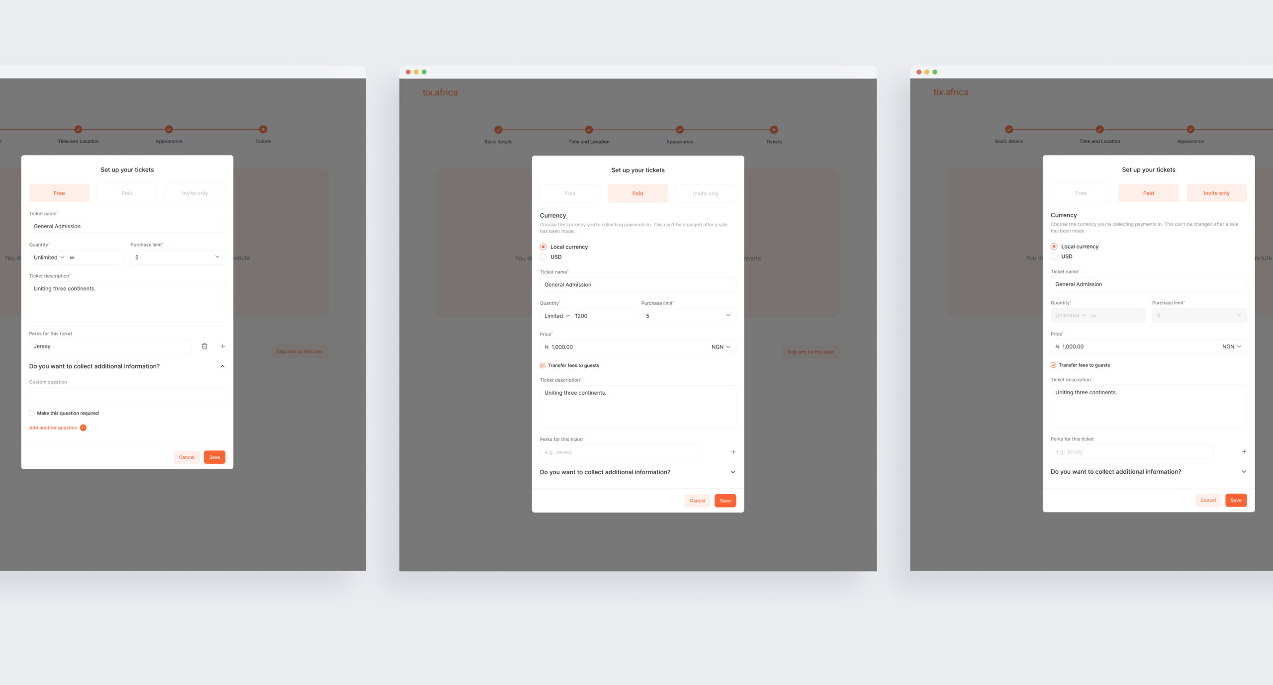
Ticket creation is split into three tabs: free, paid, and invite-only tickets. This separation streamlines the input of relevant information for each ticket type.
Paid tickets allow creators to choose currency, price, and charge transfer options. Invite-only tickets remove irrelevant fields, such as quantity and purchase limits.
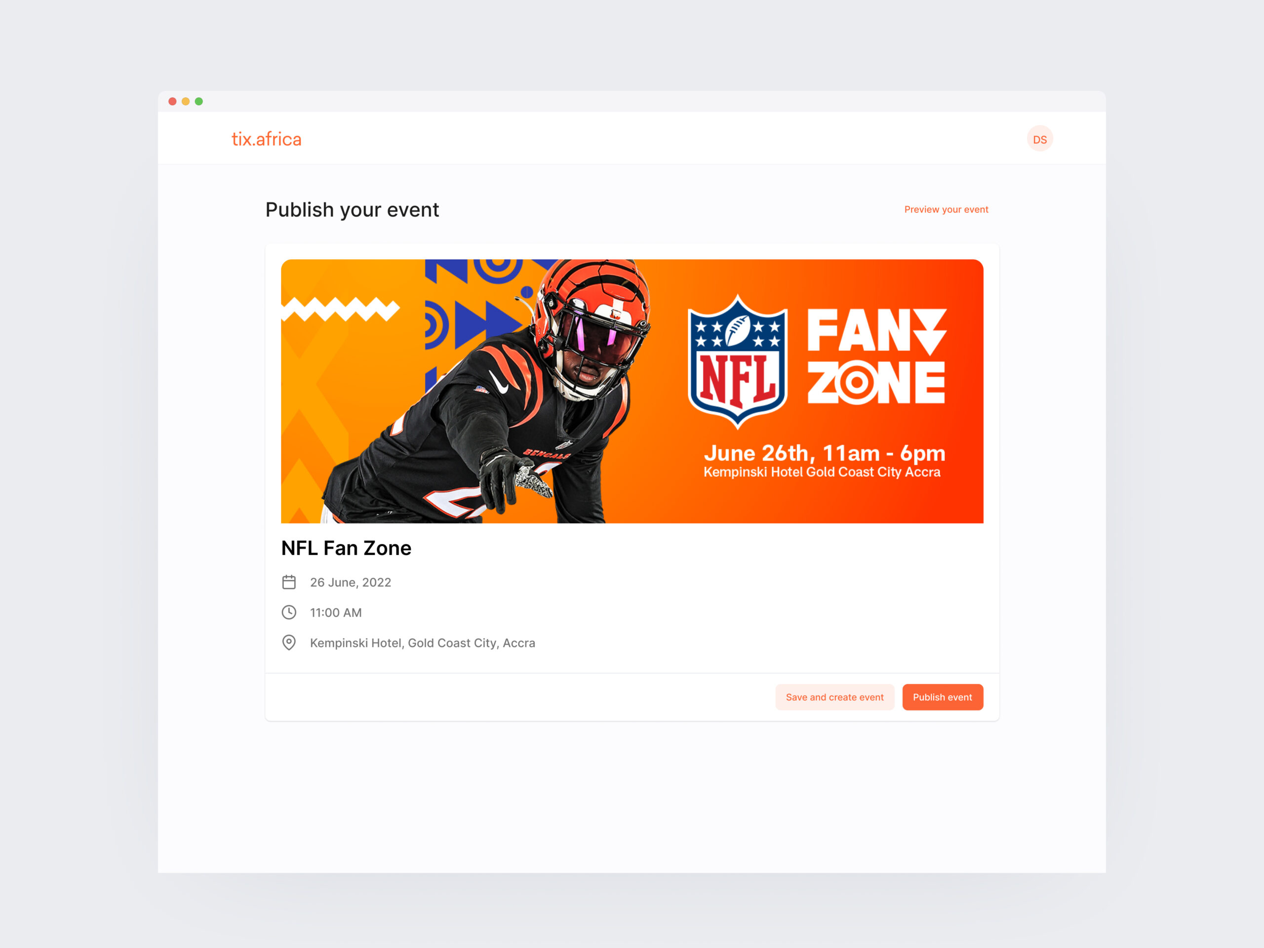
Once a ticket is created, event creators are directed to a summary page where they can preview the event's checkout page for a final review. If the creator is not yet ready to publish the event, they can save it for later editing. However, for those ready to go live, there is an option to publish the event immediately.
Improving our conversion rate was crucial for attracting various events to Tix. Our checkout funnel needed to cater to various events, from one-day concerts to booking weekly yoga classes.
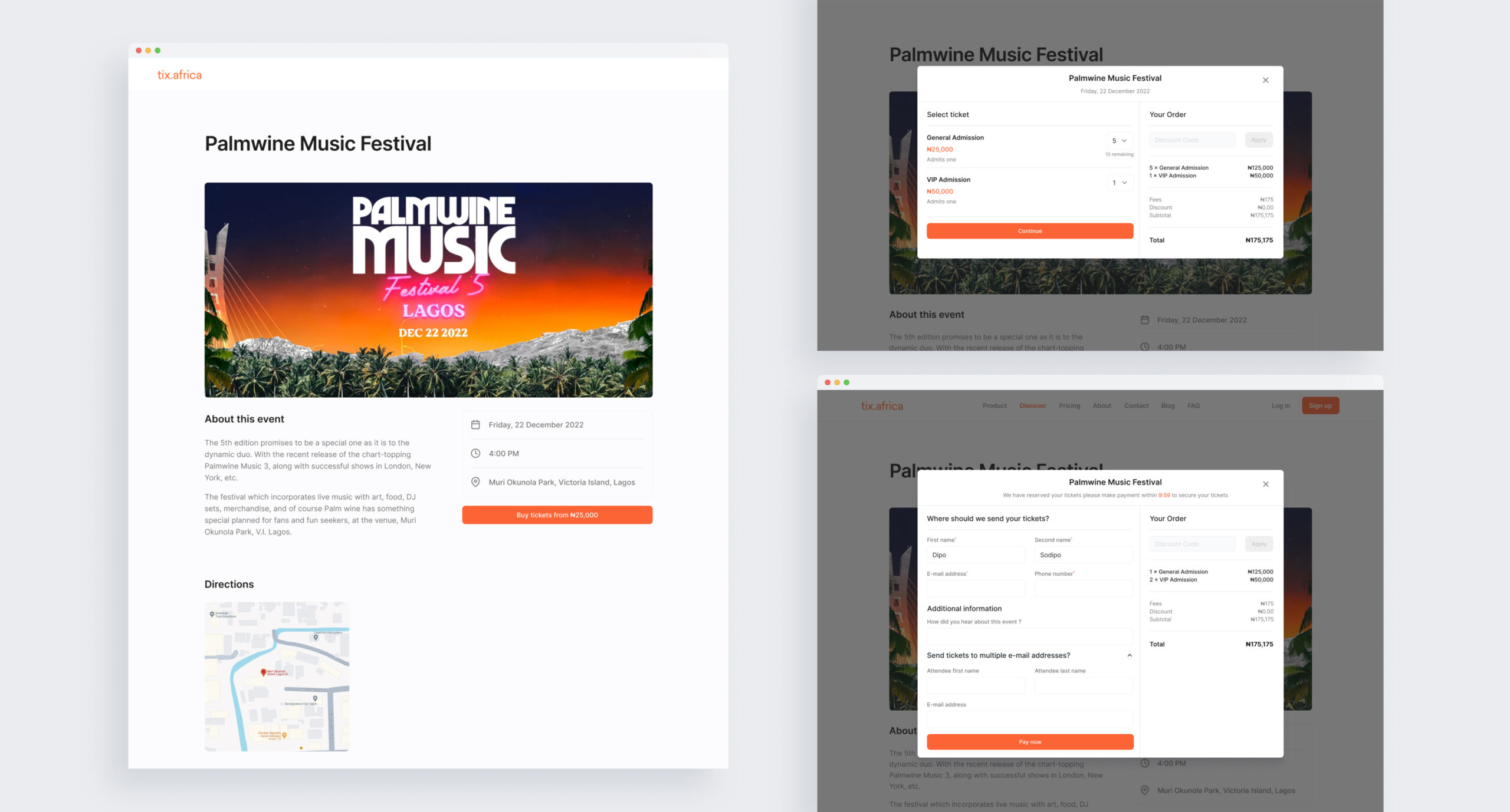
'Palmwine Music Festival' illustrates a one-day paid event on the platform. The event page displays essential information such as the description, date, time, and details. Additionally, it highlights the lowest ticket price with a prominent "Buy Tickets" button.
Subsequently, the buyer selects their desired ticket and enters their personal information, including e-mail and phone number, where e-tickets will be delivered. Next, they advance to the Paystack payment gateway, which Tix utilizes for all transaction processing.
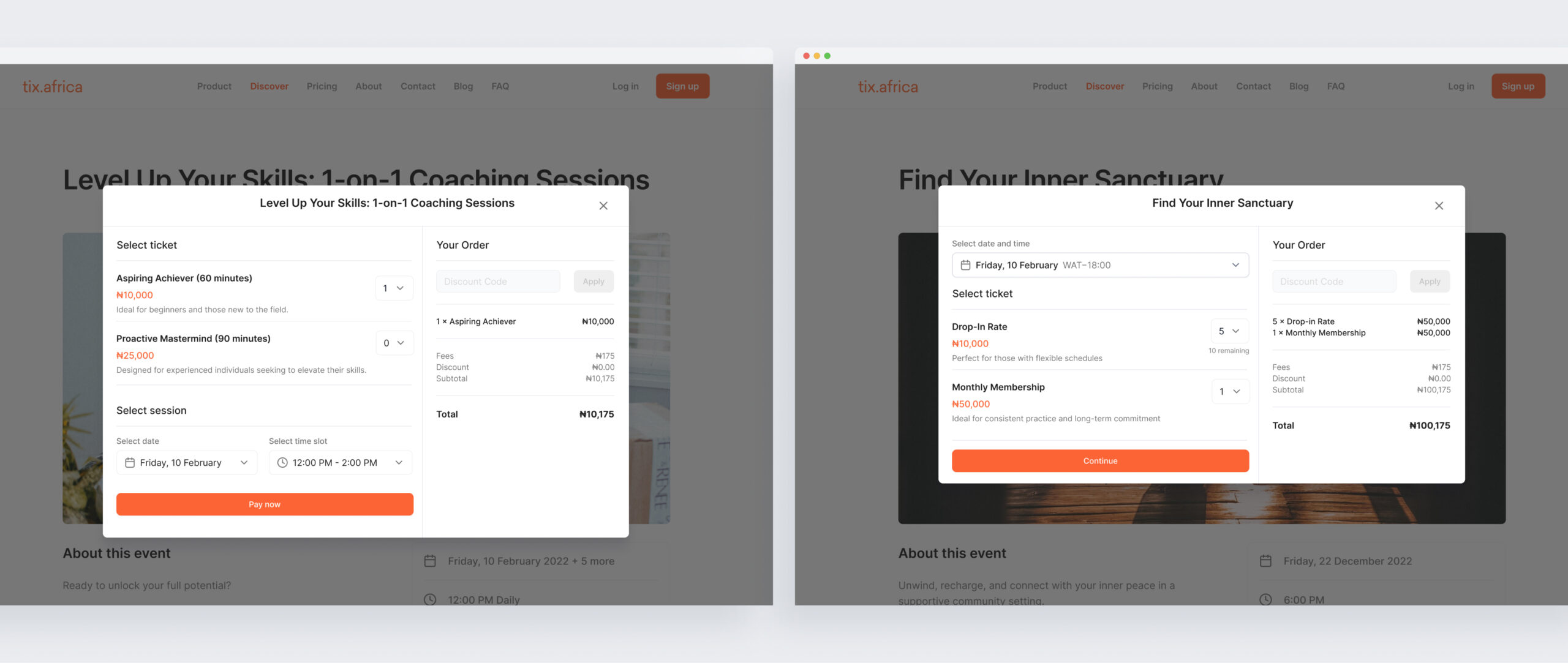
One-on-one events
During checkout, guests can choose the specific ticket that meets their needs. This could involve selecting the level of service (e.g., basic, premium), session duration, or coaching package. After selecting the ticket, guests can choose a date and time that works best for their schedule.
Recurring events
The checkout process prioritizes date selection. Guests can choose the specific date they wish to attend. Following the date selection, guests can then select the desired ticket type.
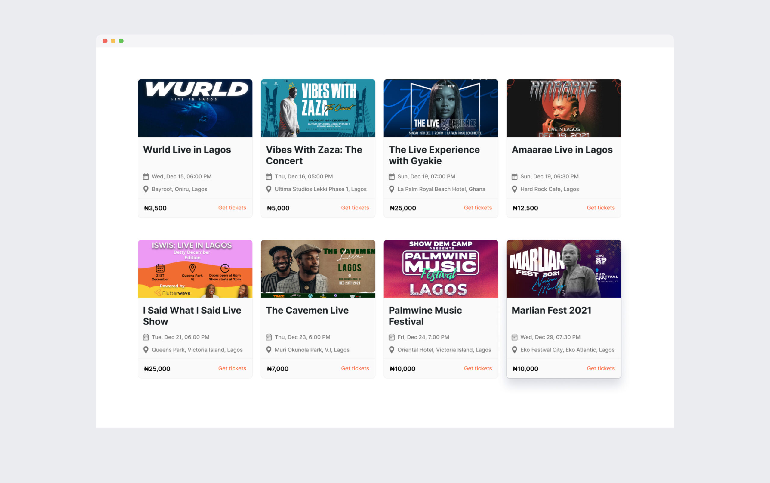
We also introduced a discovery page specifically designed to enhance event visibility. This page functions by matching event creators with potential attendees seeking upcoming events in their area. This, in turn, helps creators increase their sales revenue.
How can we assist event creators in managing, monitoring, and optimizing their events?
Based on our research findings, we created a self-service dashboard for managing events on desktop and mobile and providing a performance overview.
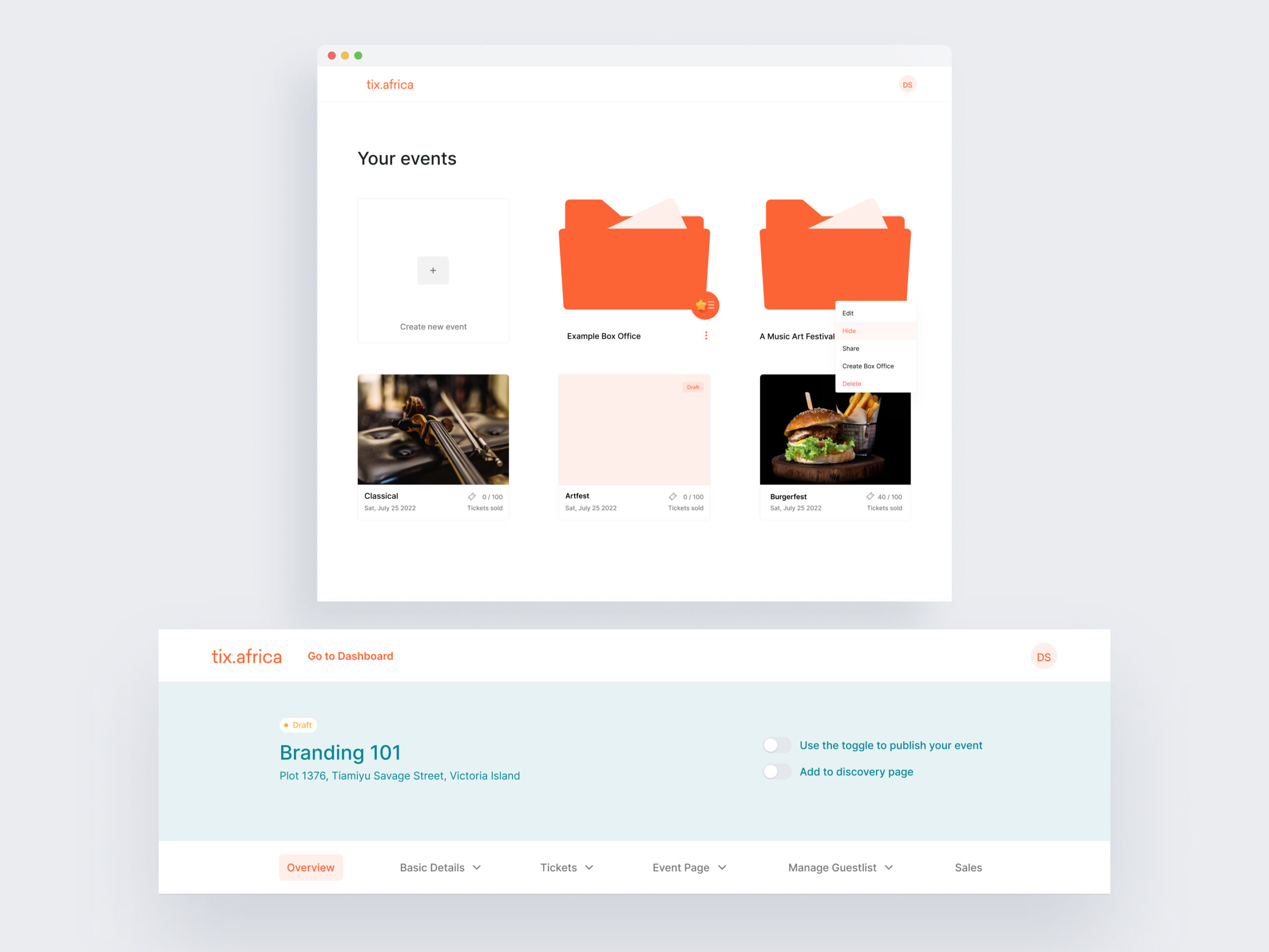
We added a navigation bar displaying frequently accessed links for event organizers while keeping track of past and upcoming events in an index.
The dashboard has a clear header with crucial event details and toggle buttons to publish, unpublish, and add events to the discovery page.
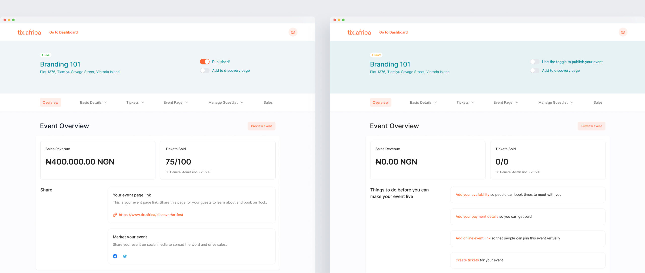
The Overview page gives event creators a quick summary of essential event details, such as the amount earned and tickets sold. Creators can also easily access the event link and be reminded of incomplete steps. This page is a handy checklist for staying organized while preparing for events.
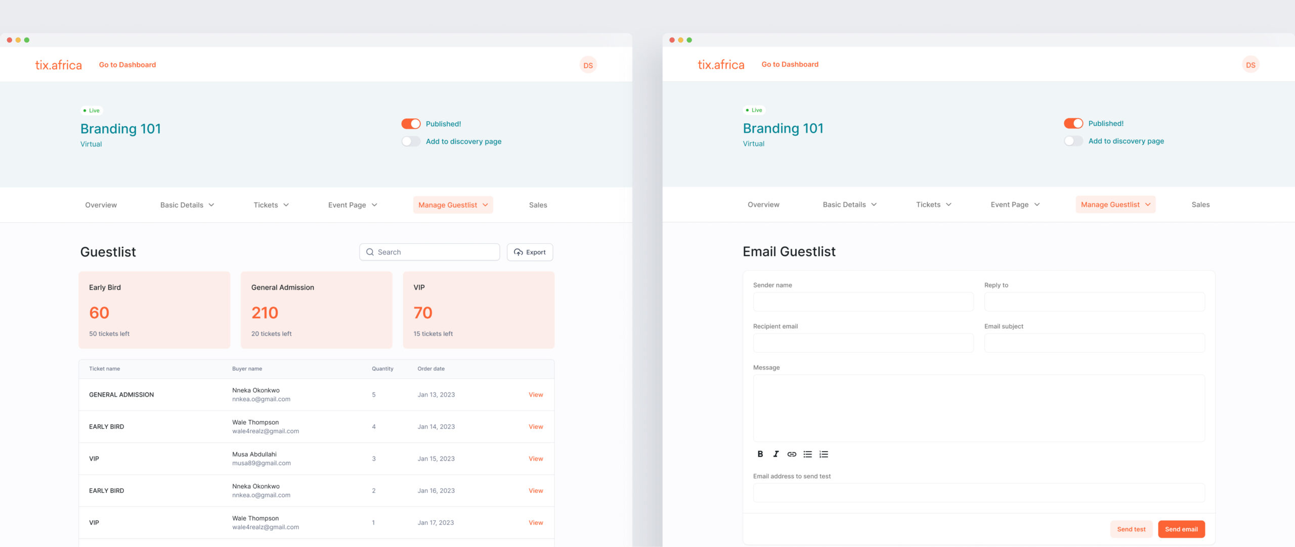
Manage Guestlist tab gives event creators a concise summary of their ticket sales, including the number of tickets sold per ticket type, remaining available tickets and buyer details.
The Manage Guestlist dropdown gives creators access to the email guestlist page. This page allows them to leverage the in-app email marketing tool to directly send emails to their guests, keeping them informed about the event.
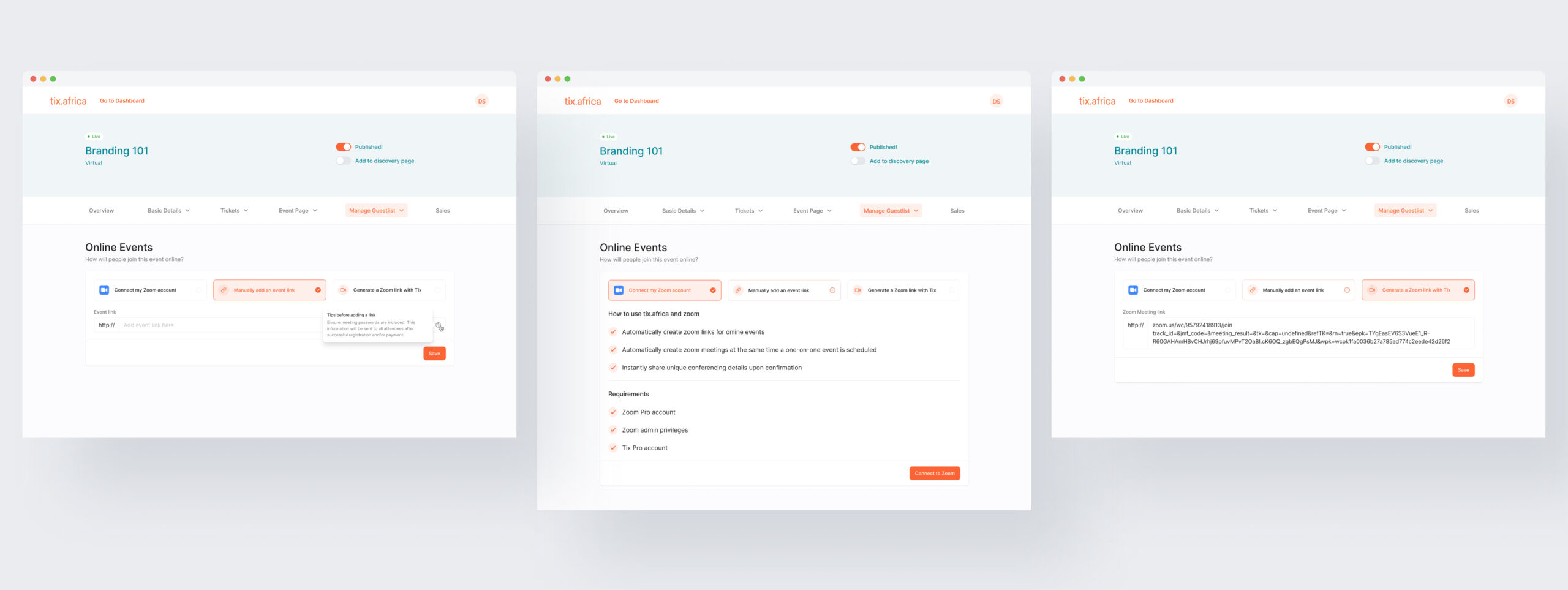
In the 'Manage Guestlist' dropdown list, there is a value for online events. Creators can configure how guests access the event online by connecting their Zoom account, manually adding an event link or generating a Zoom link through Tix.
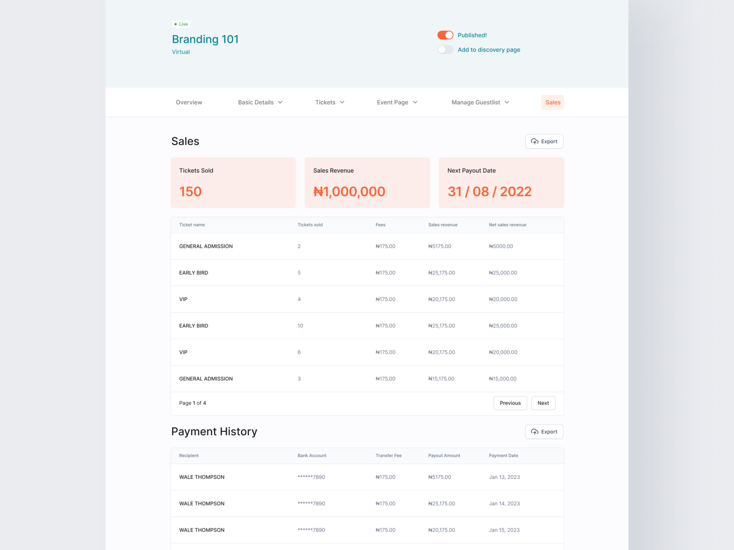
With the Sales dashboard, creators can track total ticket sales, revenue, and payout details. This allows creators to make informed decisions including food and beverage, swag, seating, and more based on real-time data.
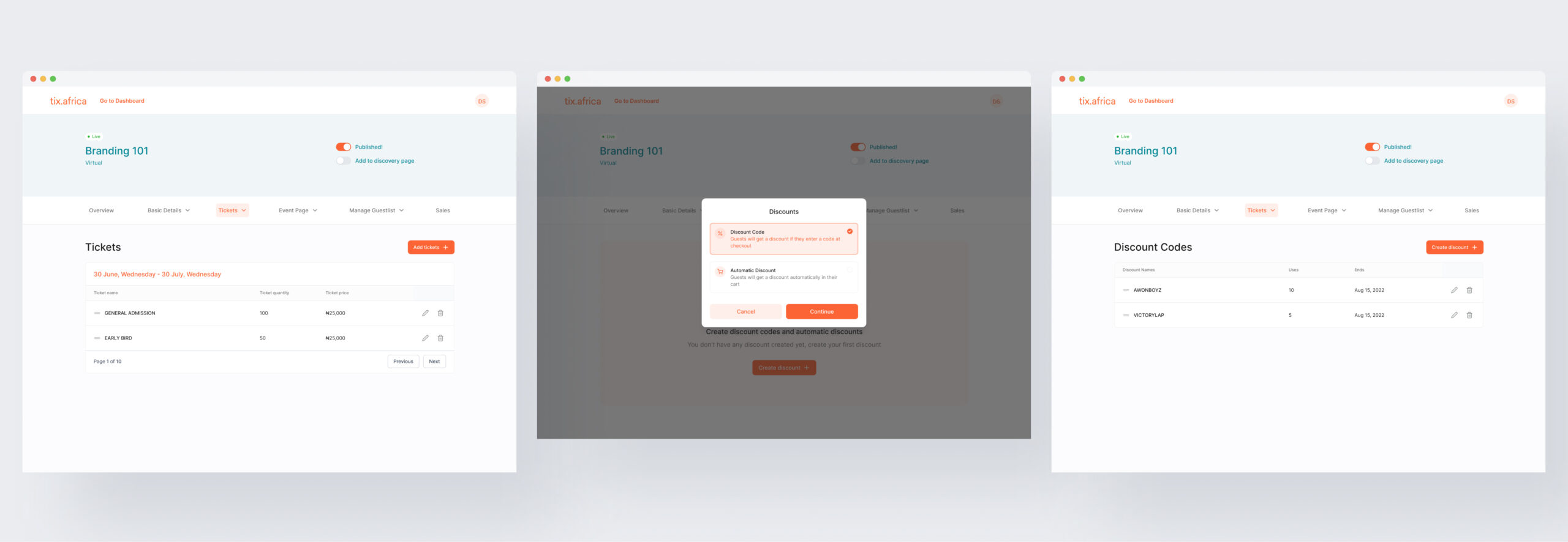
Ticket tab allows event creators to edit previously created tickets and create new ones. The dropdown will enable users to navigate to the discount code page. Using a discount code, a personalized code that reduces the prices of an event ticket can boost sales to sell out.
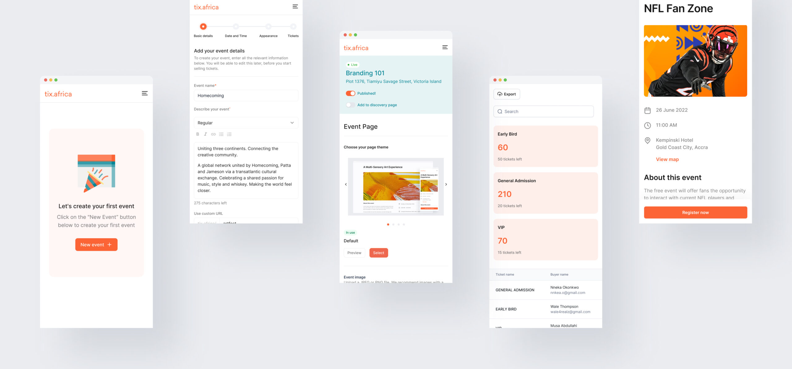
To allow event creators to manage their events from anywhere, I ensured the Tix web platform, from event creation and management to the guest checkout experience, is fully responsive on mobile devices.
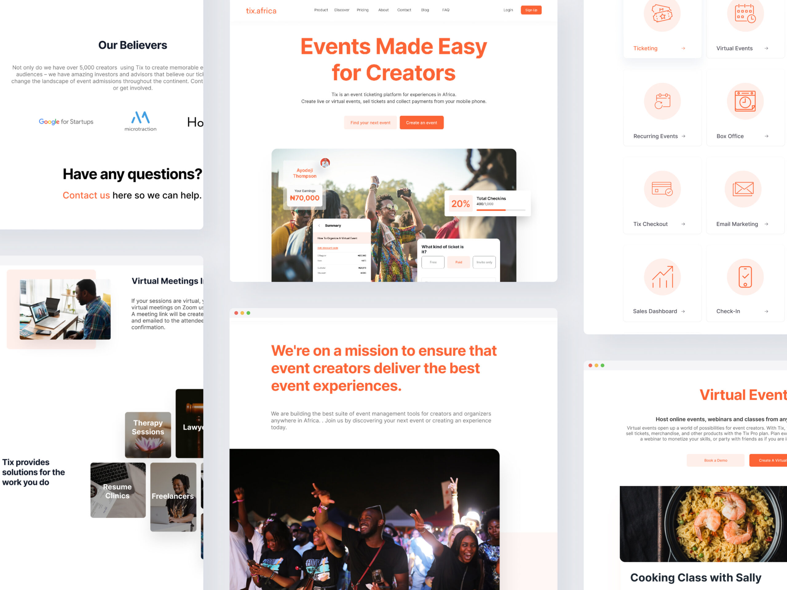
Finally, I crafted a new website for Tix to complement the web application redesign. This website effectively communicates the platform's revamped functionalities and empowers event creators by showcasing the latest tools.
Results and takeaways
This project taught me the value of quick prototyping, user feedback and iterative design. Since the launch of the new dashboard, there has been an increase in the number of events created on Tix. However, user requests for enhanced data visibility (geographic buyer distribution, event performance comparison) highlight areas for future improvement.
As we urgently needed to complete the redesign before the year-end festivities, I expedited the initial exploratory phases with plans to revisit and refine later. However, the established design patterns provide a strong foundation for future iterations.